Member-only story
CSS Flexbox 101: Vertically Align your items Now

I apologize for the clickbait title. I believe many of us still believe CSS is that messy thing everyone wants to avoid. Its 2017 and that is no the case anymore.
So in this post we will learn about CSS3 flexbox model. YAY!! 🙌
Spoiler Alert: It changes everything.
Bootstrap 4 beta was released earlier this year and moved to flexbox & Sass from outdated block model & Less. There are still some bugs in Bootstrap 4 but people are getting excited about the new framework on flexbox. So let us get some basics down on flexbox concepts.
The CSS3 Flexible Box, or flexbox, is a layout mode intended to accommodate different screen sizes and different display devices. For many applications, the flexible box model is easier than the block model since it does not use floats, nor do the flex container’s margins collapse with the margins of its contents.
1. The Parent and the Child
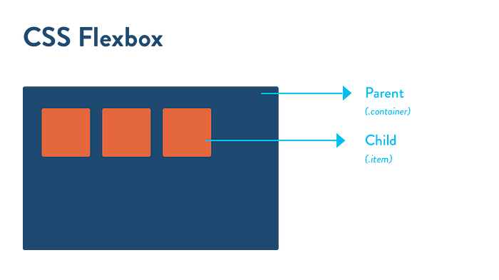
To make any element follow flexbox properties, there should be two components. The container (parent) and the items (child) which are inside the container.

To initialize flexbox just put display:flex in the parent element i.e in .container
.container {
    display:flex;
}
There are 2 properties that get applied by default on initializing display: flex;
- flex-direction
- flex-wrap
So the .containerhas the follow properties assigned
.container{
   display:flex;
   flex-direction: row;
   flex-wrap: no-wrap
}
Let change flex-direction to column and see what we get
.container{
   display: flex;
   flex-direction: column;
   flex-wrap: no-wrap;
}